Categories
ITU Copenhagen UX & Prototyping Videogames

Future development of Adventure Island

image

Alright, so I have a game, or at least a prototype of it. How can I improve it?

Because if I had the time, I would definitely work out a few quirk things that ended up unfinished.

First of all, character animation.

Because I actually made different sprites for the main character running around, at least in one direction, but I didn’t have the time to look into how to implement this in an 8 axis movement. It’s one minor thing that can make a strong difference between a sketchy prototype and a polished build.

But that’s purely aesthetics without much effect on the gameplay.

On the other hand the island, the gameworld itself, could do with a lot more detail and greatly improve the final effect. After all this is a game about exploration, and what good is exploring if there isn’t anything interesting to visit?

Stine likes games that show a lot of different areas full of mysteries, with old ruins, swamps, dangerous seas and more. For my prototype I had to put the limit at some point and I could never focus on making any area strong in characterization. I also couldn’t give my gameworld a nice, consistent story. It all ended up quite rushed in that aspect to tell the truth.

Then I would love to make the quests more interesting. I mean, right now as it is the game is full of fetch quests: go here, take this, find this guy, blow this cave, open that chest… A little bit more depth would have been very desirable. And that means lines upon lines of code, of course. It wouldn’t be so hard now that I have a grasp on the basics of scripting but it’s not something that I am willing to jump on right now.

And of course we have combat. Somehow I always wanted some sort of simple, old 2D Zelda styled combat in the game, even if to provide some extra difficulty in completing the quests. Again, this is not a core element of the game, but I really think it could evolve the gameplay a lot more. Not very complex combat sequences, but just basic sword fighting. The idea of using spells against enemies is also there, but that’s more of a second thought, even though it would be very cool.

Now, I don’t have any real plans of continuing this game any further, but I do want to keep using this little island of mine as a test lab to try out new ideas I might come up with for other games. It has the framework and now I know the tools. I’m still not perfect with coding, but I can definitely do much better now with the experience I have gained this semester.

And again, you will probably be able to try this prototype out yourself in the portfolio section. Keep reading for an update soon!

Categories
ITU Copenhagen UX & Prototyping Videogames

Final prototype for Stine

image

It’s taken forever, but it’s finally done!

The final, working prototype of my game Adventure Island (tentative title, I know the name is already taken) is now finished, complete, and will stay as it is for my final hand-in for the course User Experience & Prototyping at the IT University of Copenhagen. It’s very much unfinished, it has flaws everywhere, but there is just so much that you can do with a prototype given the amount of time that we had.

So how did it turn out?

Well… I would say that I’m quite happy with it. Especially considering that up until this moment I had never done an entire game with the Unity Engine by myself, all from scratch. Sure, I had worked before with Unity (R.E.C, Mr. Optimistic and The Hitchhiker), but I always worked with other team members for those, and always at least one of them a programmer. This time however it was only me. That means that I had to learn how to code JavaScript from zero while at the same time designing the level, making the graphics (ok, they weren’t that many, I got lazy at some point and I reused sprites all over again) and playtesting and making changes.

Not to mention that I had to remember that this game was for one person in special, not me.

I have to thank Samuel Walz and Martin Fasterholdt for helping me with some random bugs I was encountering in the build (as usual the typical mistakes: I left one “;” out of place, or “GameObject” should not have started with capital G).

But besides that I think it turned out quite nicely. The quest is reasonably long for the average player to do in one sitting without going by too fast, the world is expansive enough so that it encourages the exploration I was aiming for, and players can take different approaches at beating the game.

And you can drown in the lake. Be careful with that.

As I said there are still some bugs here and there, but those are going to have to stay for now.

I plan on making the build available for everyone in my portfolio soon enough, but that one will most definitely have a few tweaks to make it more polished for public availability. Stay updated!

Categories
ITU Copenhagen UX & Prototyping Videogames

Designing the right UI

image

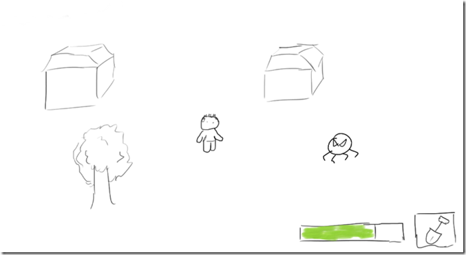
Doesn’t this look crude to you? Don’t worry, it’s just a minor sketch of what I would later on improve with Photoshop, but this here was my first attempt at designing a UI for my game for Stine.

I’m a fan of simple, non-intrusive interfaces, so my first attempt at a UI for the game was really empty, without much in the way of the player.

A simple health-bar and an icon representing the item at hand at the moment. Since the main focus of the game is on exploration I wanted to use as much screen real-estate as possible for the actual gameworld. Also I refused to add a mini-map on the screen at all times, since I thought that would detract my player from the feeling of immersing herself into the world.

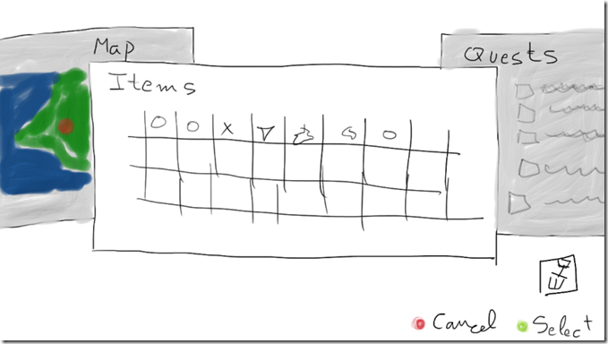
But what if the player gets lost? What if he wants to switch items, or look at the map, or just check what the quest at hand is? Well, for those moments I designed a pause menu with all those functions built in as separate pages that the player can scroll to:

image

Again, the idea was to keep things simple. Not many buttons, not a thousand icons everywhere. I wanted the player to select an item to keep at hand at all times, and then switch back to another item when necessary. By switching tabs the player could read the quest list and see an overworld map with a red dot marking the current position.

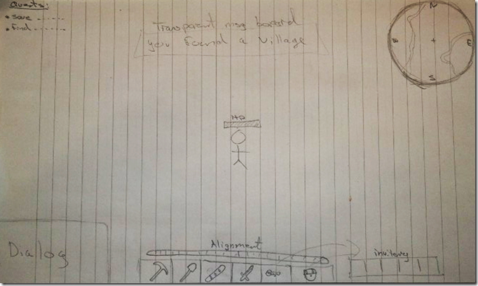
During the User Experience & Prototyping class that we held at my university dedicated to designing a UI I had my partner Martin give it a look and voice his opinions on this. He had also drawn a UI for my game with the ideas he had in mind without looking at what I had done first.

The differences couldn’t be any more shocking.

image

While far from being very cluttered, this UI showed important information like a much bigger inventory, the name of the village or area you had just entered, a quick-slot item bar, a dialogue box, a mini-map, a quests list and a health-bar located right on top of the main character.

Some things like the mini-map I still was sure I wanted to avoid, as well as the dialogue box (since I don’t expect my game to have a lot of heavy conversations or multiple characters speaking at the same time). The alignment bar was a nice thing, since the player has the possibility of doing good or bad deeds, but I thought that this was not something that needed to be immediately seen at all times on the screen.

But this UI really made me realize about something: in my attempt to make the UI I had been thinking for myself, and not for my player. My UI was very “consolified”, more apt for big TV screens and playing with a game controller.

But Stine, as shown on my previous interviews with her, prefers to play on the computer, with mouse and keyboard. And Martin’s UI lent itself much better for that type of control.

I definitely needed to make a big change here.

image

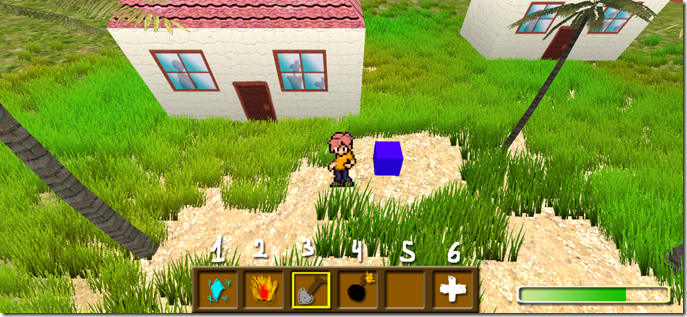
So in comes my new UI. Still aiming towards the simplistic side (also please mind that this is a Photoshop mock-up, not a real in-game UI), with an inventory better geared for PC gamers like Stine, accessible from the numerical row of the keyboard (with the 6th number opening a larger inventory screen so that players can re-organize their items into the quick-access list). The health-bar I still preferred to keep on a corner so as to maintain UI distractions on the sides rather than in the middle of the screen. This game is all about enjoying the exploration after all.

As I said, this is still a far concept from what the UI would look like in the actual game. But these mock-ups and the comments from Martin helped me realize my vision closer to that of what Stine would like.

Categories
UX & Prototyping

Presenting the first early prototype for “Adventure Island”

image

First of all yes, I know the name “Adventure Island” is taken, but this is just a working title while I define all the game rules, objective and even the world itself, which is not even an island at this point.

But what you have here is the very first early prototype of the game I’m making for Stine in the UX & Prototyping course at ITU.

Almost entirely based on the paper prototype I already wrote about earlier this month, the objective of this early build is first and foremost, to get me acquainted with JavaScript in Unity. I had already worked with the Unity Engine before (see the games Mr. Optimistic, R.E.D. and The Hitchiker in the projects section of this site), but this was the first time I was doing the coding by myself, no other programmers involved. This meant learning quite a few things from scratch. I tried a visual scripting tool, but it didn’t help much without at least understanding a few of the basic things of JavaScript, since I was constantly hitting a roadblock when my 3rd person controller object wasn’t detecting the collisions with the other interactive elements of my scene. It took me quite a while to figure out what was going wrong (hey, I’m not a programmer, remember?) but eventually I got it right, so with a few tweaks here and there I managed to get a working framework which will later on let me expand this game world easily by reusing the current code.

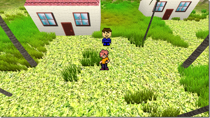
So basically this prototype is still pretty much devoid of gameplay. Sure, you can talk to NPCs, they trigger events, and you can use the boat to cross the lake (even though right now it still looks as if the main character is WALKING on water). But later on I intend to add some minor combat element into the game as things get bigger and better. Not that I have much time left for making combat very interesting and innovative, so I will borrow many things from the good old Zelda playbook.
image

Yes, this game is being heavily inspired by the Legend of Zelda series. Considering that this is a project for a course in which we are meant to make a game for someone else, not ourselves, you could think that I’m playing foul here and using a game that I like as a model (because yes, I’m a HUGE Zelda fan). But if you’ve been reading my previous entries about what Stine likes in a game, you will definitely agree that a game based on exploration in the way that games like Zelda and Oblivion (should I start making references to Skyrim now that this new behemoth of a game is out?) do it.

But of course this game is neither Zelda or The Elder Scrolls. And neither is it World of Warcraft, as much as Stine would love to see it (mind you though, she is waiting for the game that will finally beat WoW so she can jump into it and lose herself in this new world).

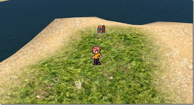
But I’m taking cues from here and there. You have a relatively big, open world (Zelda and Skyrim check), with some areas closed until you have the right item/progress in-game that you find in chests (Zelda check), characters who give you quests that add to a log (Skyrim check) and in the future, I hope, simple combat based on sword and spells (Skyrim and Zelda put together for a check).
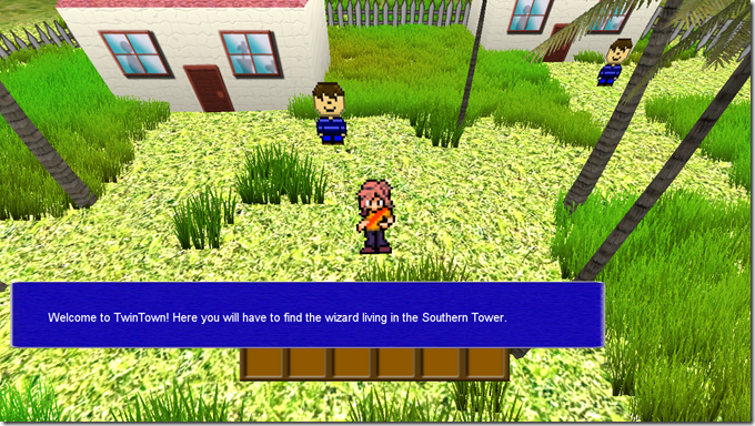
image

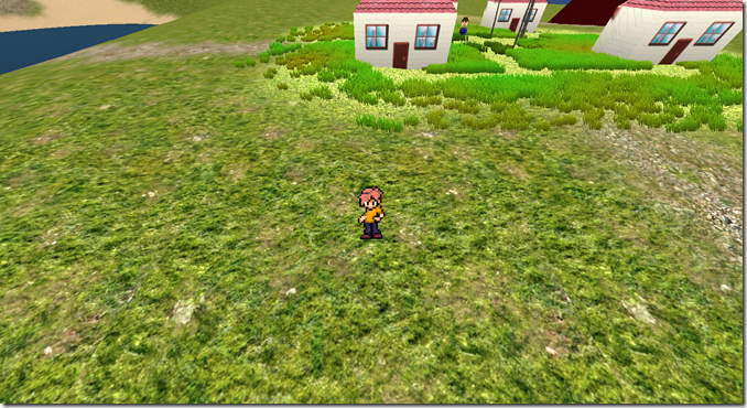
But my focus of attention is still on the exploration aspect of the game.

While still unfinished this world already has a forest, a lake, a volcano and a town, with some paths here and there so that the player doesn’t get lost, but it’s still pretty much a green land without much to do or discover.

What I did though was work on the camera: when the player is in a town or in an important area, the camera zooms closer to the character (which, by the way, is still an unfinished one, and needs to be changed into a girl, more on that in future posts). This way the player can pay attention to the tiny details of the areas. Say, for example, an inscription on a wall (something I know Stine will be very keen to look at and decipher what it means) or a window with someone looking through it. Also when the player talks to a character the camera zooms in even closer so as to emphasize the characters who are interacting with each other.

But when the player heads out into the open, the perspective changes. It doesn’t zoom out the camera. Instead I’m changing the field of view of the main camera. This makes the main character appear still big enough so that he is not lost amidst a sea of enemies or other things in the world (of course, once I start populating it with such elements), but allows the player to view what lies around her much better. This distorts the view in the corners a little bit, but I think it also gives a nice effect of the world being kind of round.

During the presentation of this early prototype in class, someone made a good point by asking that, if Stine likes exploration, why would I offer her a world that is not entirely open right from the start, but instead restricted until she gets the right items. My reply to this is that, based on the interview I had with Stine over a month ago, Stine likes the feeling of knowing there is a place she cannot reach yet, and she will keep trying again and again every time she has a new ability or item to see if the area has already opened up to her.
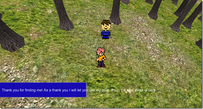
image

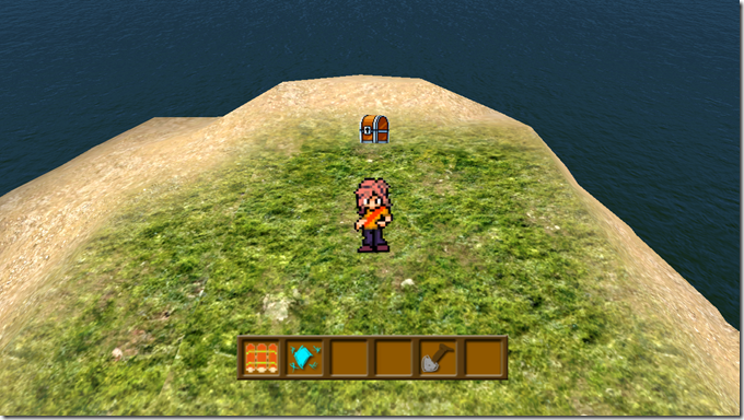
But in any case this is still a very early prototype, as this last picture summarizes.

I hope to really improve this in the following weeks to transform it into something that Stine will really like. And, as usual, I will post my progress here as the days move on.

Categories
UX & Prototyping

Paper prototype, tried and true!

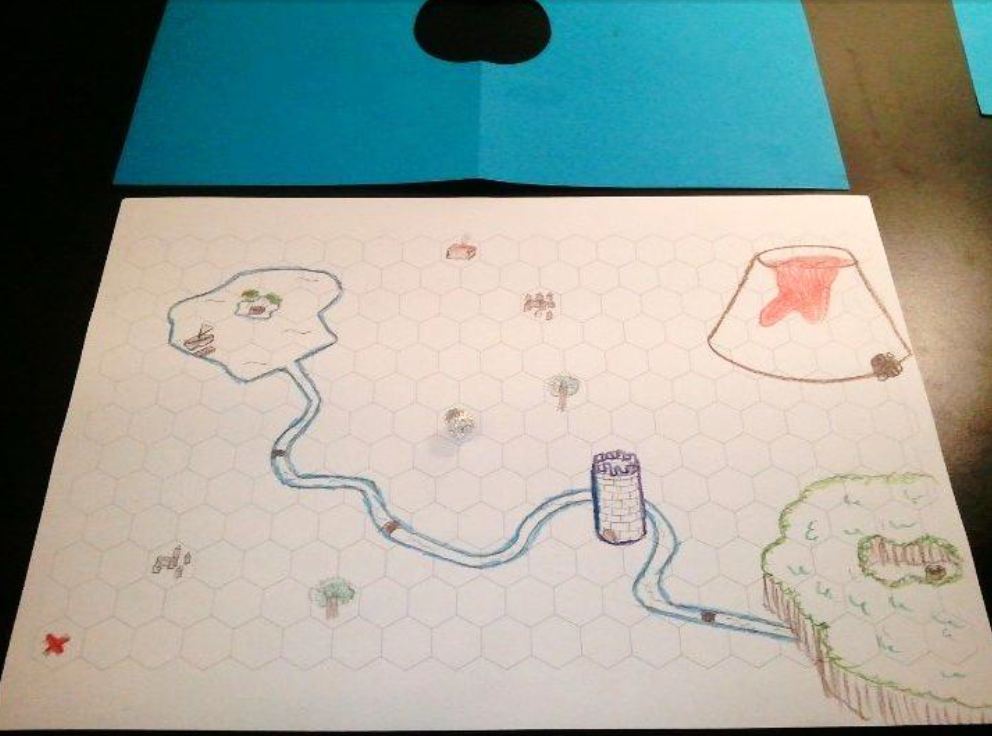
What you see here is the very first paper prototype of my game for Stine, the girl I am making a video game prototype for in my UX & Prototyping course. It might not seem like much at first, just a simple (badly) hand-drawn map on a hexagonal grid with a small ball of aluminum near the middle of the map (it’s kind of hard to see in the picture, but it is there).

So… what is the point of this map? Does it actually serve a purpose? Is it some kind of D&D game?

Not at all! This, along with some blue paper with a hole in it and a script that I have written get together to make a paper prototype that has actually fulfilled its purpose very well. Either that, or Stine lied to me when she said she liked it.

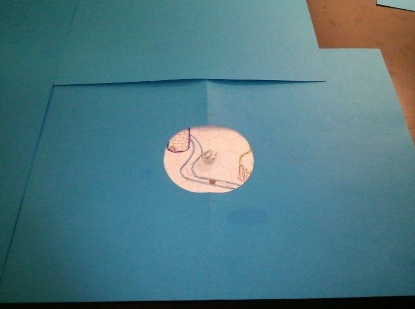
You see, this is what Stine actually sees when she plays my paper prototype. Just a very small area of a map, with the rest all covered with the blue paper.

I gave her some very simple instructions: her character (at this point still undefined) has to find her way through the map to reach a great wizard who has locked himself up in the top of a tower. What reason she has for finding the wizard I left it up for her own imagination.

The problem is that the door to the tower is locked shut and there is absolutely no way that she can break it or climb the tower. So she’s going to have to find her way through by exploring the map, talking to villagers and perhaps acquiring some equipment. After that, I told her nothing else and I just read to her the parts of the script that I had prepared for whenever she reached specific points of the map, like the villages, the lonely hut on the North side or the spot marked with a red “X”.

Why make a paper prototype like this? Because, as mentioned in previous posts about this project, Stine LOVES adventuring and exploring in games. So my intent here is to have her move around a game world of my own creation and see how she reacts, how she moves and how she thinks (aloud) while playing it. This will help me shape up the first digital prototype of the game and represents an important step forward into creating a game entirely from the feedback of another person.

And how did she do while playing the paper prototype? That’s a very interesting thing: it was totally unexpected for me. She REALLY believed herself in this game world and feared for the life of her character. For example, one of the villagers told her that a thief hides himself in a hut to the North. She needed the treasure that the thief had taken, but when she saw that the hut had smoke coming out from the chimney she decided it was best not to break in because she was afraid the thief might be in. Since she didn’t know if she could really die in the game she was trying to be very careful about it, and refused to enter the place, instead going out to explore the world some more and maybe coming back later.

There were also some funny moments. She found a lone tree for example, one that I had drawn there merely for decoration and to avoid the map being too empty. But she was disappointed that it was only decorative and expected something else out of it. So she… hugged the tree. Yes, that’s right. She felt like she needed to interact with the tree, so she hugged it. And not just once, she did it more times when she came across it, in case that could somehow affect the outcome of the story.

More interesting for me as pure feedback was that she re-visited some areas that she knew she had already completed to see if things had changed in a way. For example, she went back into the forest where she had already opened a treasure chest because there might be something new in it.

Another important fact was that she was expecting small details that could hint her about the game world itself, like footprints of some kind of animal (in fact she was disappointed that there were only human footprints around).

The final, very important piece of feedback I got was about the size of the map. Since the view she had was at all times very limited, this gave her a feeling of the world being much bigger than it actually was. This is something that I intend to apply in a very easy way into the digital prototype, which I will discuss later on, even though I have already started to code it (yes, me, someone who doesn’t know a thing about programming, is coding this game by himself…)

That’s it for now. The next step is to create an early digital prototype based on this paper one and making good use of the feedback I got from this. And I already have some neat ideas.


Categories
ITU Copenhagen UX & Prototyping Videogames

It’s video prototyping time!

imageWP_000185

In what has probably been the craziest and funniest lecture for User Experience & Prototyping, today we learned about video prototyping. That is, creating a video that serves to test a design instead of creating a digital, coded prototype that would probably take more resources and time to prepare.

And of course a UX class is not the same if there is not a short time to experiment with the new methods learned, so today we got together in small groups to come up with a quick idea for a game… and video prototype it.

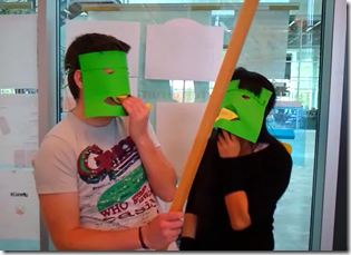
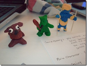
This time I worked with Morten Hansen and Lasse Hansen to create the Drunk Goblins video. Just the name and the two pictures above should give you an idea of how much fun we had working on it.

We used anything we could quickly find in the short amount of time we had (so yes, don’t expect the next Steven Spielberg production) from play dough and paper to foam to create a few set pieces that would be used to represent our idea of a game in which you control some goblins set on stealing all the brandy a St. Bernard dog uses when rescuing people up in the mountains (the St. Bernard being the restriction we had to use when coming up with the game idea).

With a few quick and extremely dirty editing touches (I didn’t even have time to take out the parts where you can hear us laughing while recording, or even saying “action”) we put up this short video.

Again, don’t expect anything big. But it’s good for a few laughs and, overall, shows up the potential of what a video prototype can do. Definitely a method worth giving another try!

Special thanks go to Wen Xiong for helping out as a goblin and Ronny Nilson for being such an awesome Swedish skier Winking smile.